I designed an employee self-evaluation&learning app end-to-end, from designing the UX wireframes and user flows to delivering the visual design outcome. I set up a design strategy for the visual design to boost engaging experience to help users be deeply immersed in the self-growing user journey.
Application
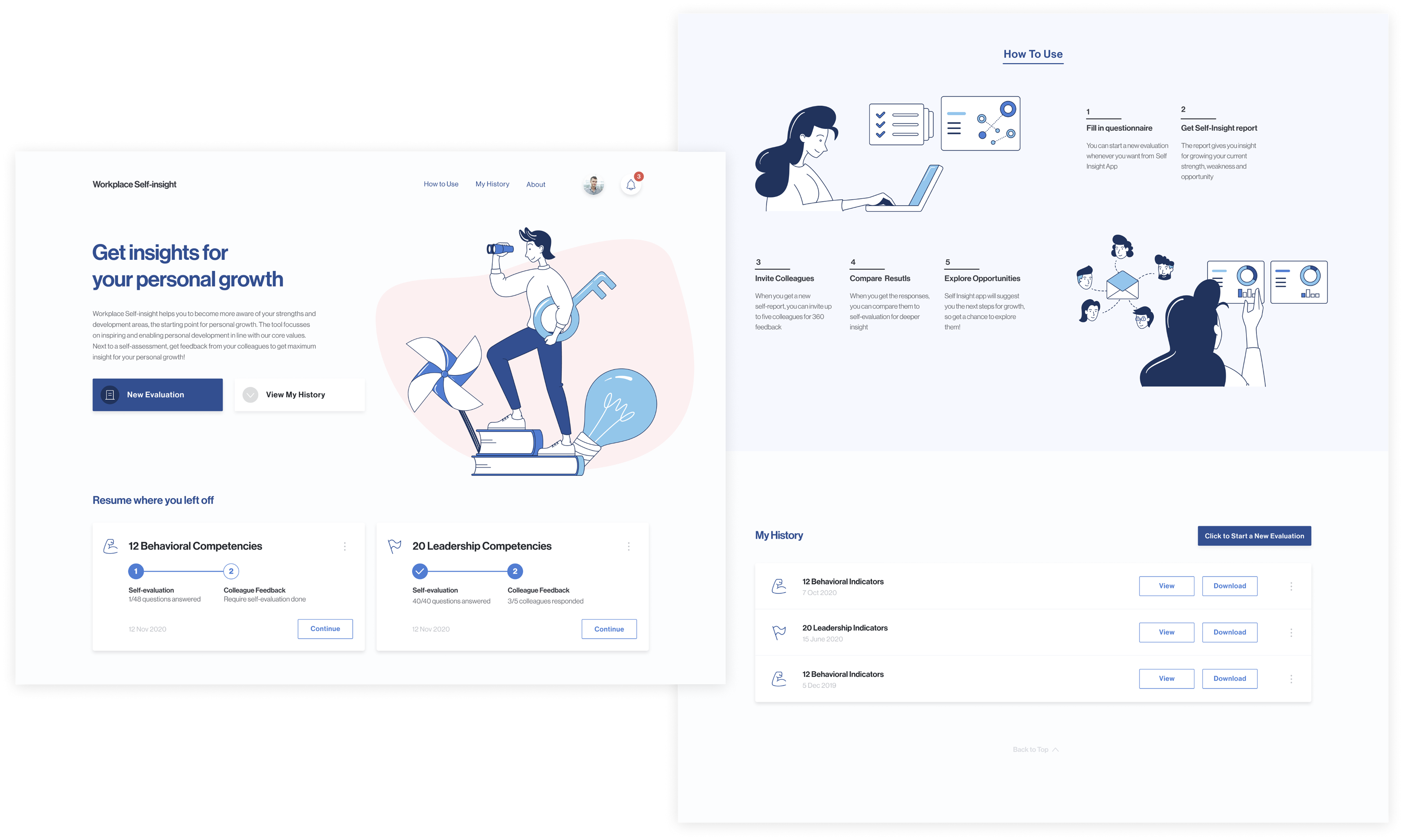
Workplace Self-insight App
Workplace Self-insight App
Role
UX Designer
UX Designer
Contribution
UX design, UI(visual) design
UX design, UI(visual) design
Key Challenge: Bringing out Engaging User Experience
The lessons learned from the team's previous attempts revealed that the employees tend to have low levels of motivation to use and satisfaction from employee applications, especially in the self-learning context. But the team was still not experienced in rolling out any projects that are appealing to employees and encouraging users to dive into use flows. Accordingly, we had to start from establishing a guiding principle and strategy for designing engaging user experience at workplace.
My Solutions
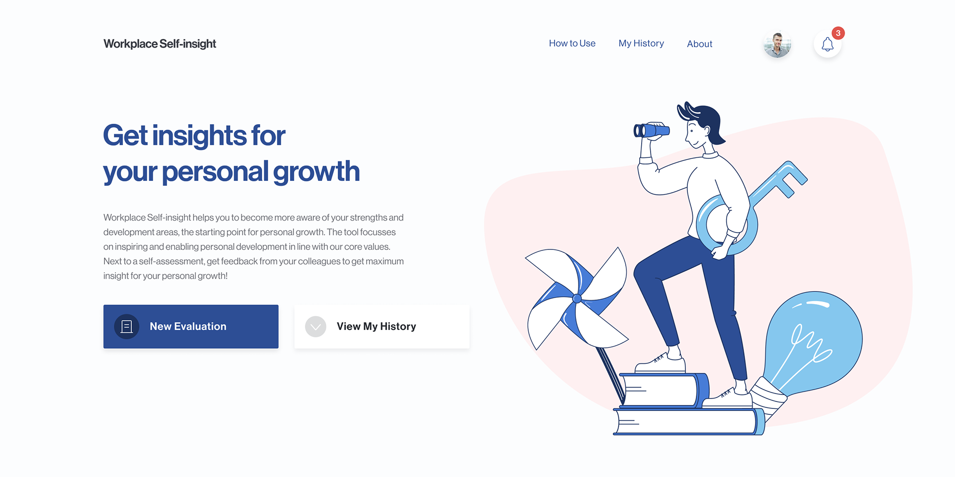
Use of Illustrated Images for Inspiration
I suggested using a few illustrated images and created a few illustrations to explain the application's value and how to use it. The intention was to convey a mood that is not heavy nor rigid. Because that kind of mood is what employees usually feel from office apps and easily discourages the users. As we expect illustrations to inspire imagination, they would fit the self-learning context better than photographs.
The use of the illustrated images turned out to be effective throughout our field trials. The users responded that they expected and enjoyed a unique experience from the application, and it was more exciting than other workplace apps.

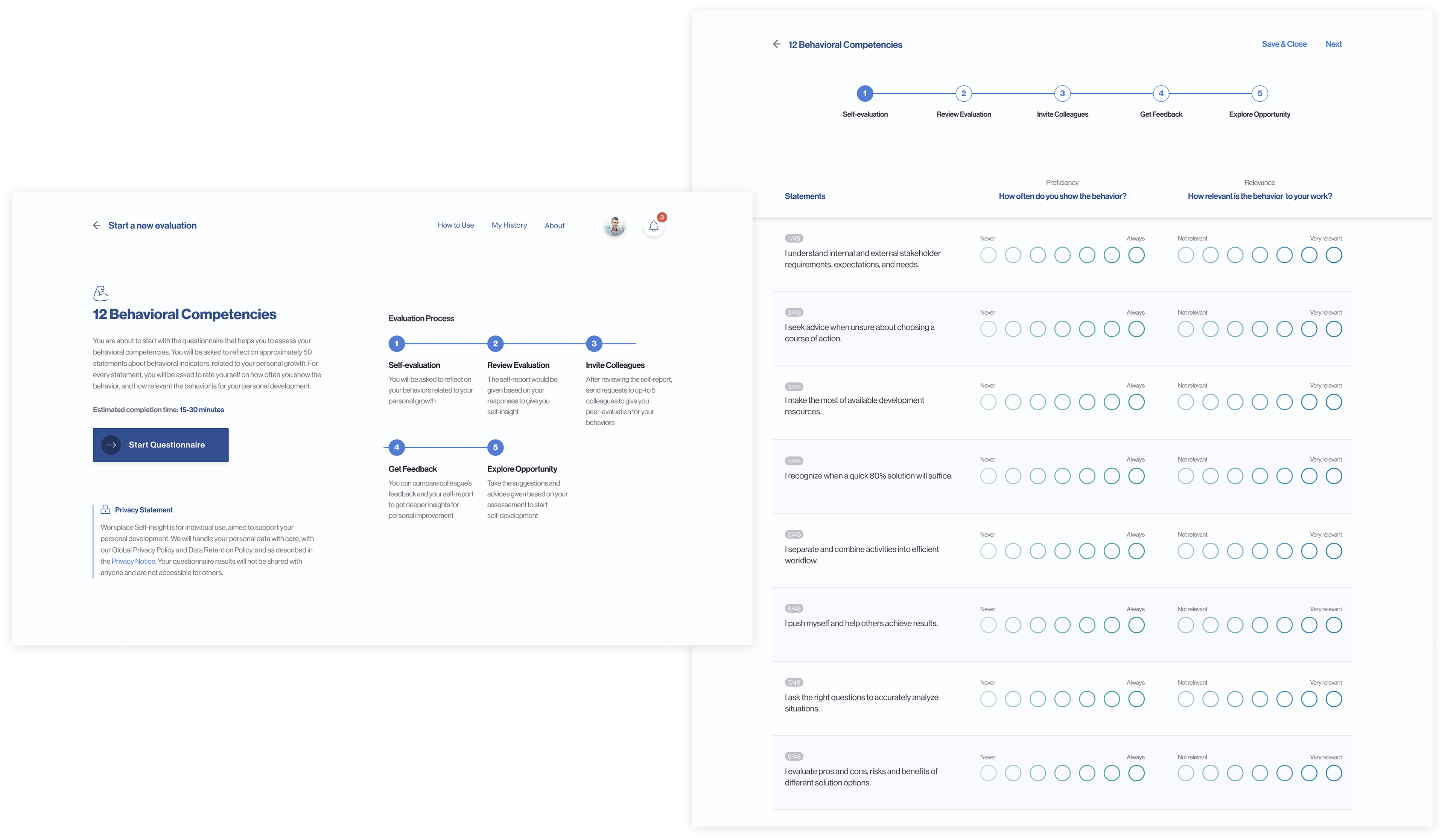
Animations for Rich Experience
The next suggestion was the use of animation to bring out rich experience in the app. One of the cases is the animated scale buttons for the self-evaluation questionnaires. I designed the interaction to help users feel more excited and concentrated as they read and answer the list of questions. To measure the design's expected impact, we made two self-evaluation forms with the different types of scale buttons (the images below are animated type and normal type scale buttons). We distributed the forms and collected feedback from respondents on their experience of answering questions. The findings supported the assumption as the respondents found that the animated scale buttons are more interesting to use.
Scale buttons with rich interaction

Scale buttons with normal interaction
• 52.2% of respondents preferred the engaging style design compared to the standard style
• The respondents chose the engaging style because it was more interesting and was different from other workplace apps
• The respondents chose the standard style because it was faster and efficient to answer to the many questions
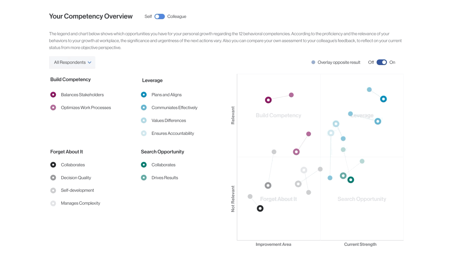
Information Visualization
Communicating the evaluation result and learning material is also an important component of the self-learning experience. As our application offers self-evaluation and peer-feedback features, it required extra consideration in designing how the evaluation information is visualized. Because the information includes evaluation scores from different perspectives (self vs. peer) and many different categories (12 types of behaviors). To provide a clear overview of the evaluation result, I designed the information display and corresponding interactions to review and compare the evaluation scores.
Measures
The app was launched and first tested to selected employees before it was rolled out to all employes. We collected from over 200 selected employees in the global offices including US, Germany, the Netherlands, China and Korea branches. It turned out that the employees found the app to be easy to use and inspiring as they used the app for self-learning. Inspired by the result, the team decided to roll out the application 2021 and continue to work on improve the application to the next level.
Final Design
Click on this link to access the interactive mockup of the application.