For low user satisfaction and insufficient business performance of the service, I led the team to develop a service strategy and redesign the application based on user needs and user behavior data.
Application
Naver Cloud Mobile Application
Naver Cloud Mobile Application
Role
Lead UX Designer
Lead UX Designer
Contribution
Design Strategy, User Data Analysis, UX/UI concept design
Design Strategy, User Data Analysis, UX/UI concept design
Throughout this project, I suggested the UX/UI design concept for a mobile cloud storage application. I designed a simpler information architecture to reduce user load when exploring menus and content and organized interface components based on strategic intentions and insights from user behavior data. I also visualized the concept using screen mock-ups and UI flow maps.
Key Challenge: Low user satisfaction and user attention
Naver Cloud, a cloud storage application, had no clear service strategy. Therefore, it had too many menus and features which were added up spontaneously by feature-driven approach for service design. It also failed to offer an attractive user value.
Accordingly, the user behavior data on the app revealed that most of the menus and features were rarely used or visited by users. Also, the business performance of the team was decreased as it costed to maintain all of the functions.

My Solution
My suggestions for the team were 1. setting up a service strategy, 2. designing new concepts for the user value, and 3. restructuring the application to make the new user value clearly visible to users.
🔍 Research
I focused on the data which shows users' behaviors and opinions for the application, because the data can be strong evidence for making design decisions. I analyzed the user behavior data collected from the application as well as the statistics of customer service inquiries, in addition to listening to the actual user voices.
🔭 Strategy
Based on the understanding of user needs and pain points on personal cloud services, the team created a service strategy of "helping users organize cloud space and files."
💡 Ideation
According to the strategy, some core features including advanced search function and shortcuts to categories, were suggested and refined.
🛠 Design
Finally, to make the user value visible, we needed to restructure the application in order to rearrange existing features and menus. To do so, I analyzed user behavior data and suggested a simpler navigation structure. With the simpler structure, the app has a better chance to make meaningful suggestions for users.
🧭 Measure
To measure the impact of the new design, we monitored user behaviors after we brought out some changes in the actual application based on the concept. The statistics of page views and feature usage told us that the changes made a meaningful impact for both users and the business.
My contributions
Analyzing user behavior data
The team was collecting user behavior data on the application but was not using it for insights. I analyzed the data statistically and elaborated findings with some quantitative research outcomes (e.g., user interviews). The insights helped the team making decisions for rearranging the current features and generating new concepts.
Leading team for building service strategy
I led team to set up new and reasonable service strategy. The strategy was helping users tidy up their photos and files, and organize their cloud spaces more effectively. To achieve the new goal of our service, I had to work out various problems including simplifying the existing information architecture and making experience of organizing cloud spaces more compelling.
Suggesting reasonable information architecture
To organize existing complex applications into a simpler structure, a framework was required. To develop this framework, I devised user behavior data to determine which features should be emphasized. The current Naver Cloud Service mobile application has many menus provided through the Hamburger GNB. The service attempts to provide photo- and drive-centered usability and tries to copy its competitors’ utilities and content. All these menus and functions added up to a service without a system, so I rearranged them into a reasonable set of menus with simpler task flows.
Visualizing ideas
To present the new information architecture and navigation flow, I designed screen mock-ups and UI flow maps.
Research and Insight
To understand the users better, we first started with interviews. We recruited twenty users who have diverse profiles from light to heavy and that used the app for different purposes such as backing up individual photos and sharing videos. We also analysed the two types of user data including user behavior data on the app and customer service inquiry history. The user behavior data showed us how frequently users were clicking on buttons and how much time users were spending on the screens. We used them to figure out the important tasks and major obstacles for users. Meanwhile, the history of customer service inquiry showed us the problems that occurred often for users when using the app. By doing so we collected a wide spectrum of user feedback andguiding insights for redesigning the application.
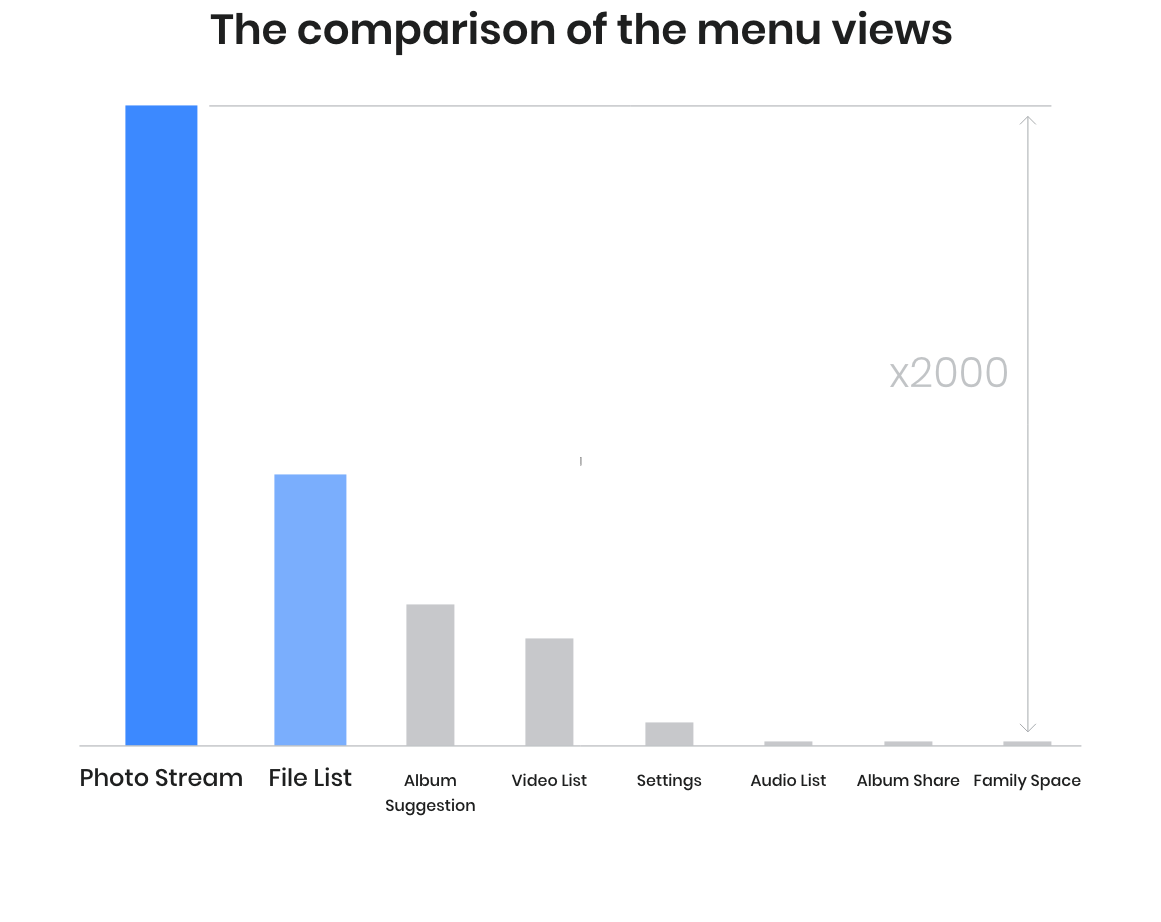
The user behavior data supported the findings from the user interviews. The page viewership's on the menus revealed that only the menus related to browsing raw lists of photos and files got high views while the rest of the menus, such as content suggestions, lists of other types of content, and photo album sharing got less. This indicated that the application had an unnecessarily complex menu structure, and the drawer menu and hamburger GNB button only increased the amount of steps to reach necessary menus.

The hit rates on the main navigation interface also showed problems in the interface structure. Users had to click the hamburger button frequently to call the menu drawer to switch to another menu. This indicated the problem of the hamburger menu that increased a user’s burden when navigating. Also, the search function wasn’t used as much as expected. Despite the search function helping users browse their photos and files, it seemed that users didn’t understand how to utilize the function to make using the app easier. Meanwhile, a relatively high hit rate on the edit mode button proved that users have a need to organize their photo and file lists.
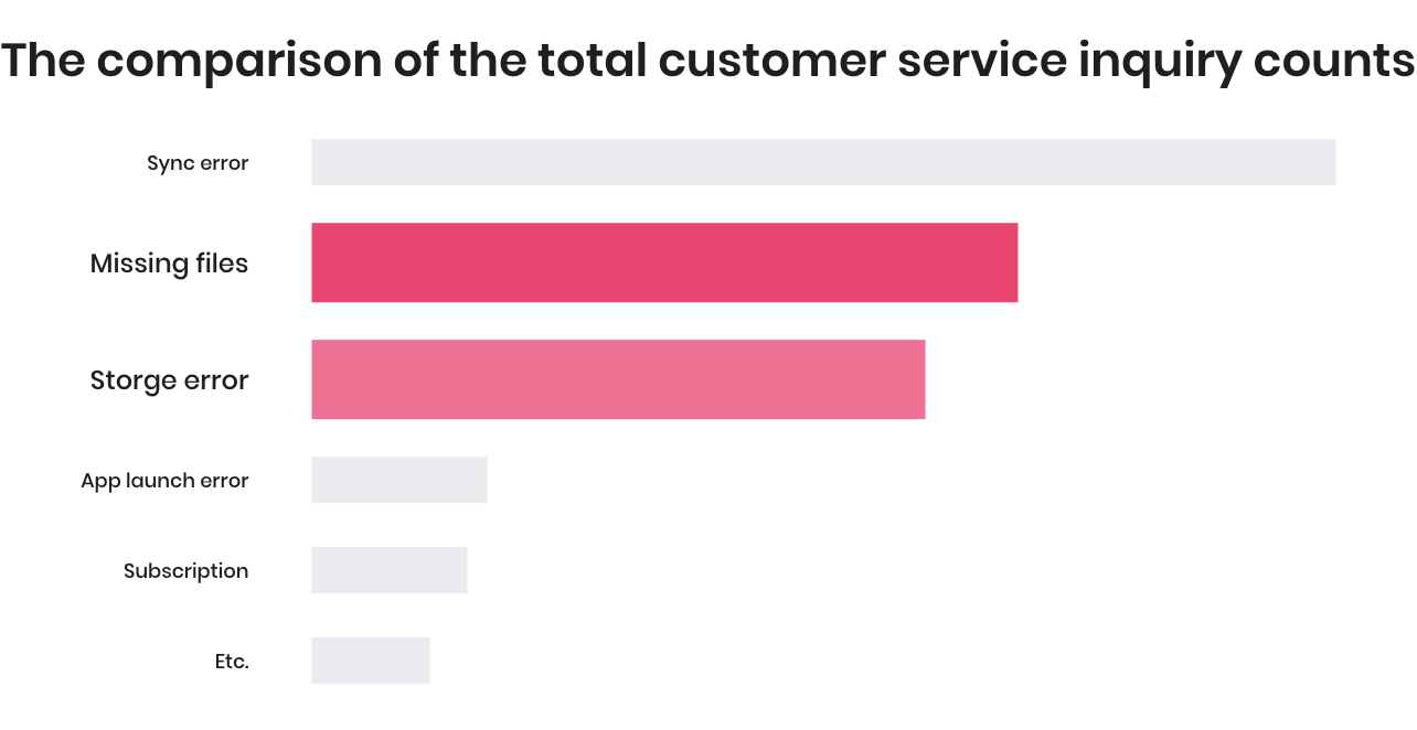
We also looked into the statistics of customer service inquiries. The numbers revealed that, besides some technical issues while using the application, the problems of missing files and storage errors were the most frequent inquiries from the users. According to the customer service logs most of the problems happened from users not being able to locate their files because of the menu structure. For example, users misunderstood that some files were missing while they were looking into the wrong menu, or they couldn’t notice that a large amount of files remained in bins taking storage space.
Service Strategy
Helping users organize cloud space and files
Naver Cloud's service strategy is supporting users for managing cloud storage, photos and documents. We focused on the problem that these days lots of digital contents are happening around daily lives of people. The files are stored on users devices and cloud storages without order, making it hard for users to find what they want to use. We set up the strategy to solve the problem. Moreover, it also assists the cloud business, because if the cloud spaces are used more effectively, the cost for offering the space also decreases.
Ideation
Despite we set up the service strategy, the application had too many menus and features, making it hard to show the core value of the service. Therefore I put the priority on simplifying the service while designing the new concept. To address the problem, I devised user behavior data and our strategic hierarchy. I summarized the two highlights of this project in the following sections.
Hightlight 1
Data-driven Design
Mobile cloud UX and UI design involves trade-offs between simplicity and functionality because the service offers many essential functions, but mobile screens have limited space. To make such sophisticated decisions, I investigated user behavior data gathered from the existing service.
Menu navigation, searches, uploading, and item management are all essential tasks that require on-screen UI elements. To arrange them without overwhelming visual design , I examined user data related to feature use in the existing service and established a function hierarchy. Below are a few findings and insights I applied to the concept design.

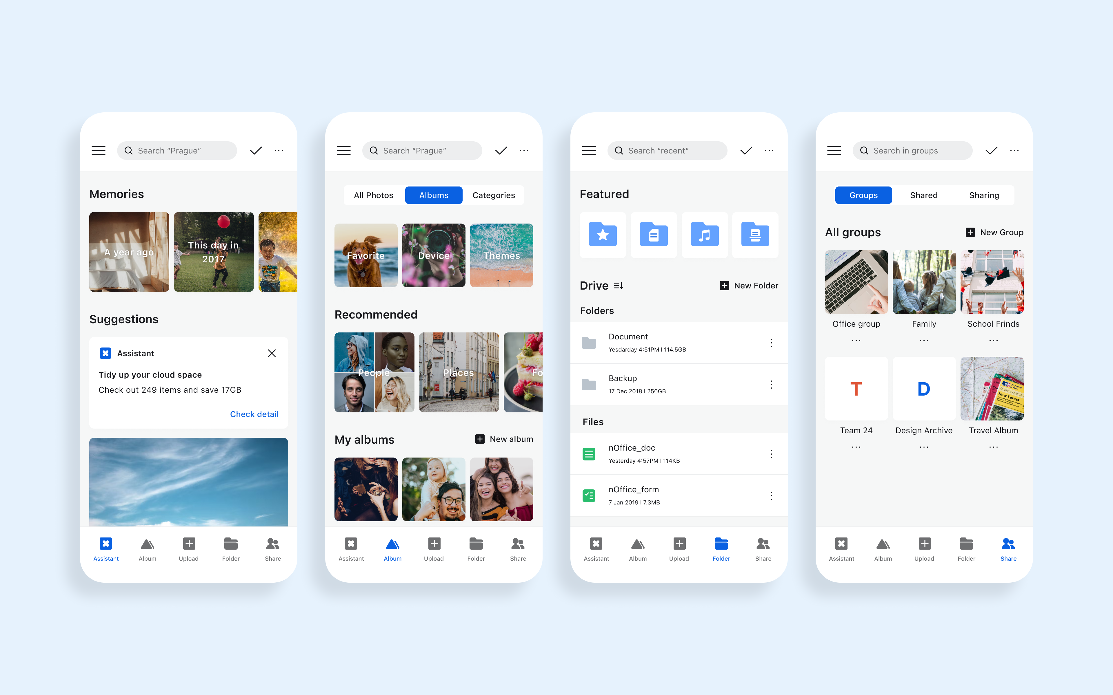
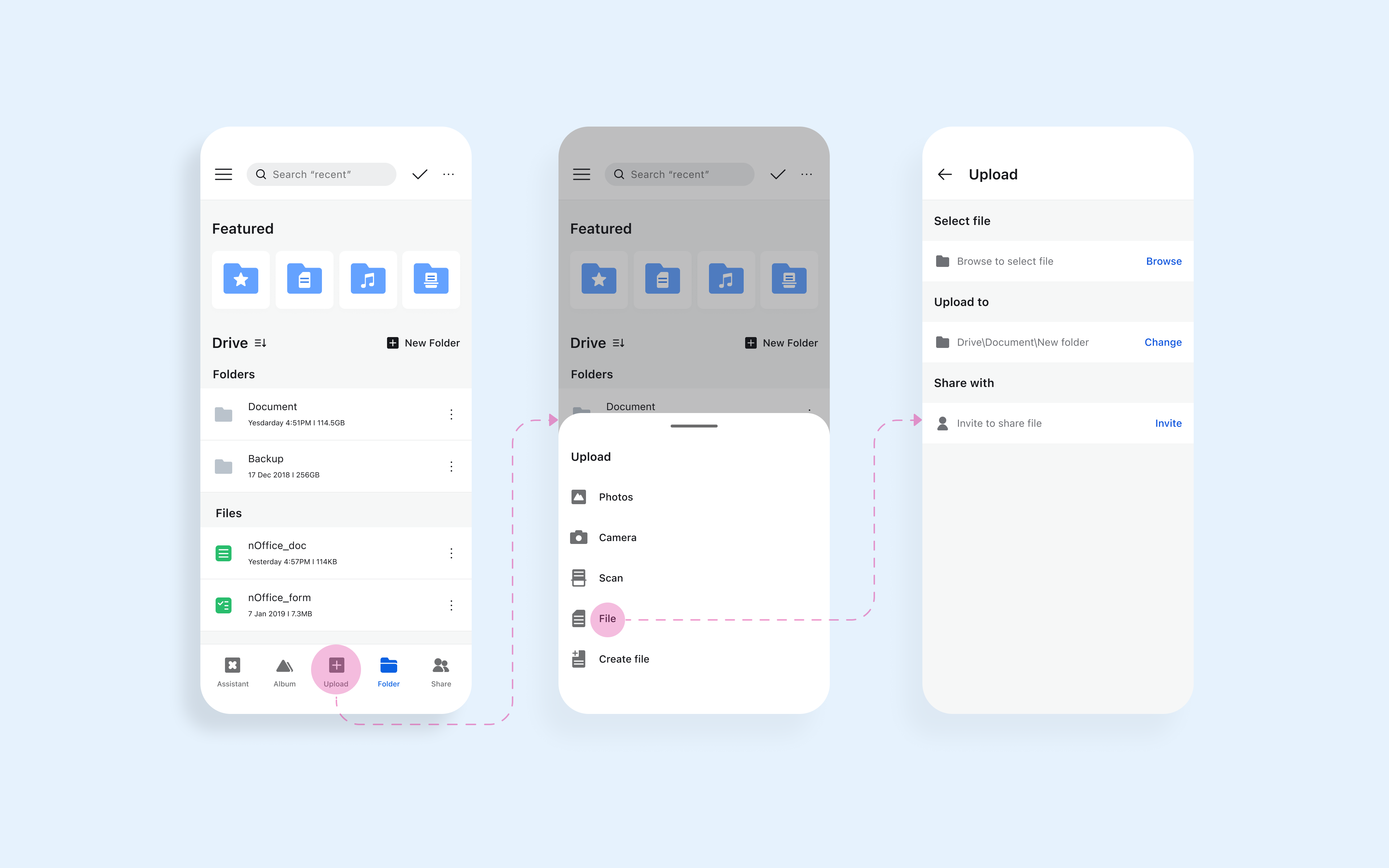
Editing item lists in albums or folders was the most frequently used task after viewing items. This was unexpected at a first glance, because we expected that uploading items would be the most frequent task. We observed users’ behavior to interpret the results. It turned out that most users use auto-sync to upload content to the cloud, so much of their content is unnecessary and disorganized, making it hard for users to find the things they want. Users frequently manage the list of items in their cloud storage using edit mode (meanwhile, the long-press shortcut to enter edit mode was rarely used because the function is not visible). Based on this observation, I decided to place the button to enter edit mode on the top bar to make it visible and accessible.
Uploading documents and photos is an essential function even though its use rate is lower than other functions. Formerly, it was presented as a floating action button (FAB). It was easily accessible, but it sometimes interrupted users while they browsed albums and folders. The FAB also often confused users. In general, FABs are used to perform screen-dependent actions. But the FAB in our service only provides uploading functions, so users often expected that the FAB included creation of new items on current screens (e.g. albums, folders, groups), To avoid such unnecessary interruption and misunderstanding, the upload button was placed on the bottom bar in the new concept.
Overall, the UI design of the new concept improved menu accessibility and search functions by avoiding visual overflow.
Highlight 2
UX design by Strategy
When we analyzed the service, it had low market competitiveness. Compared to other services in the personal cloud market, our service lacked attractive user experience, such as intelligent search or a service ecosystem. To fill the gap between leading services and our service, it was critical to offer such features and point out changes so users would notice the value of our new offer. Among various features, we thought searching and favorite content would be the most valuable upgrades for users because those features enhance accessibility to digital content in cloud storage. This would reduce the burden of wandering among menus and functions, which was suggested as the most important challenge for our service.
Nudging to use search function
Searching by keyword is the most helpful utility for cloud storage users when they want to manage their content and storage in a meaningful way. However, the search function use rate in the existing service was low because the function was difficult to find and understand. I suggested placing the search bar in the top area with hint text that displays examples search queries to help users understand how they can search for their photos or documents in clever ways.

Easy access to featured content
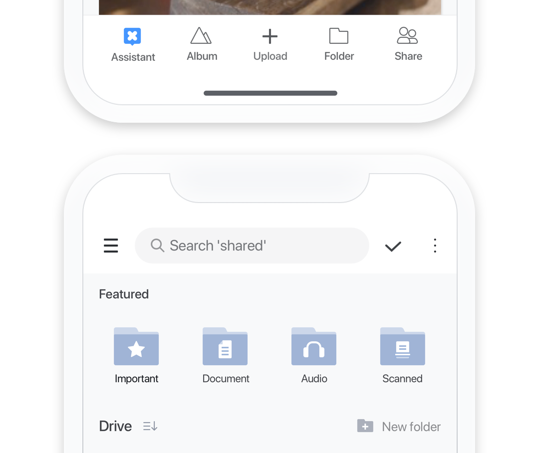
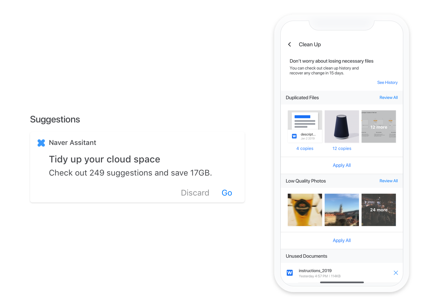
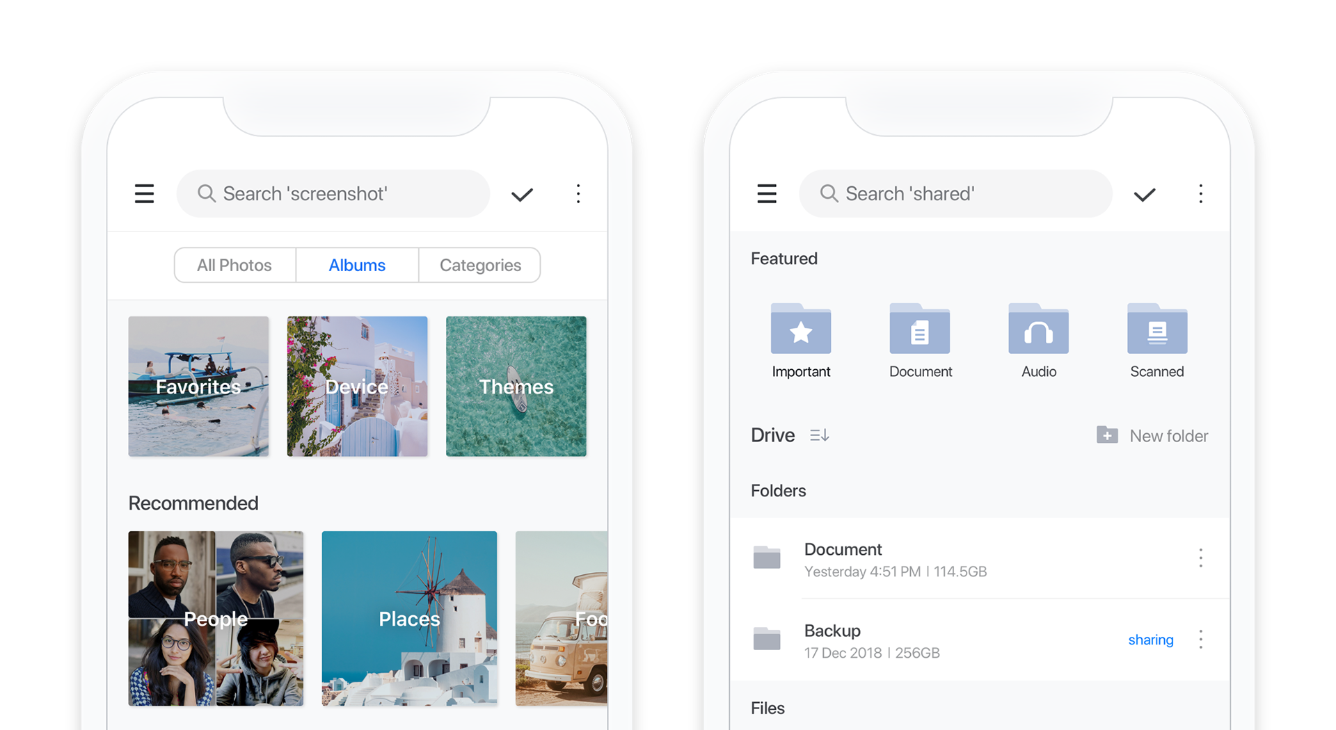
I suggested adding easy access features on the screen, not hidden in the GNB, such as favorite albums and quick access to content by type (important files, documents, audio files, and scanned files). These features supersede the old menus and can satisfy users who want to browse for content as they did using the former menus, which were organized by media type. These features also increase the visibility of and accessibility to functions when they are hidden in the GNB drawer.
Delivering design concept
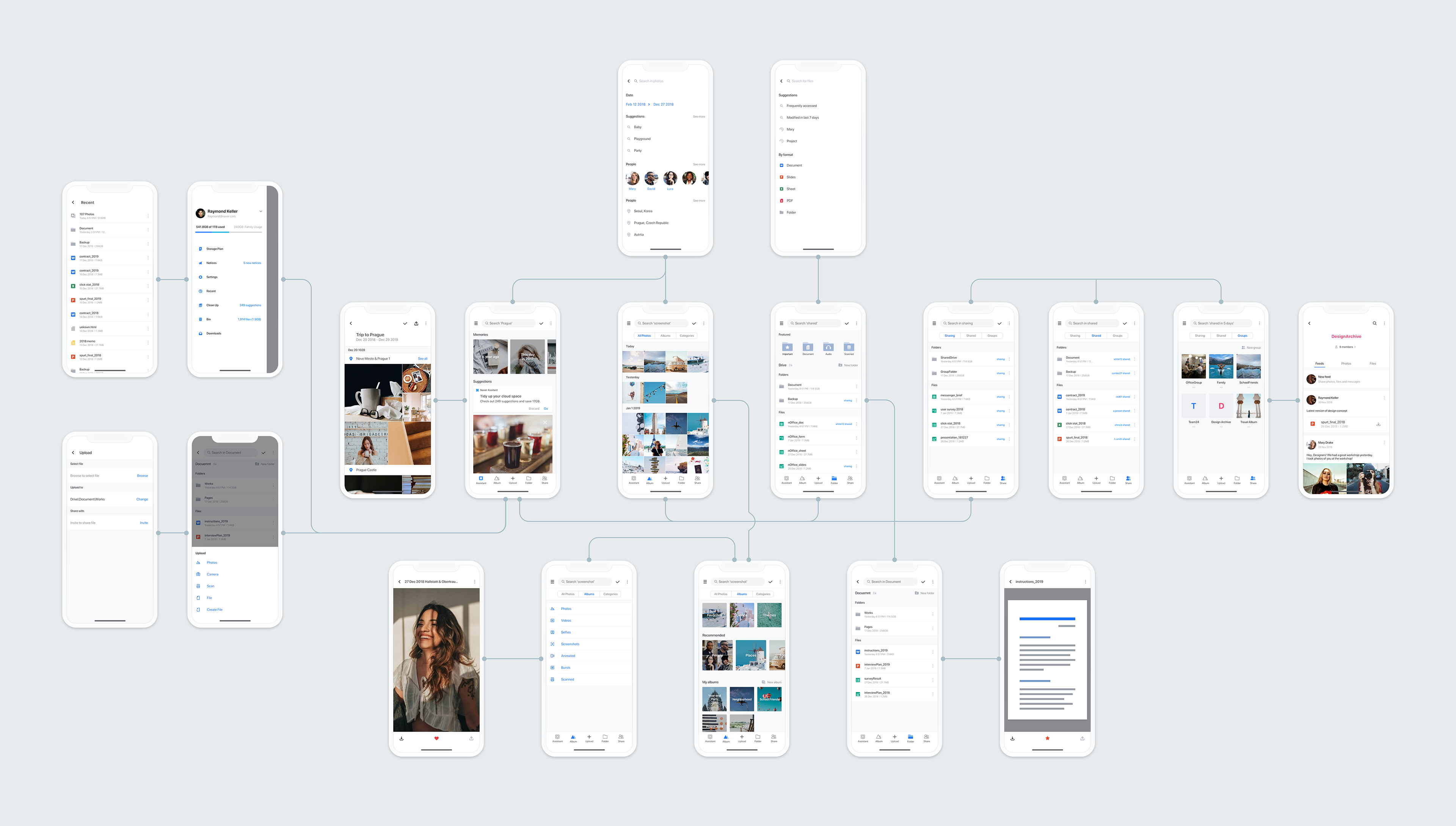
The following mockups are the representative screens of the new mobile UX concept.
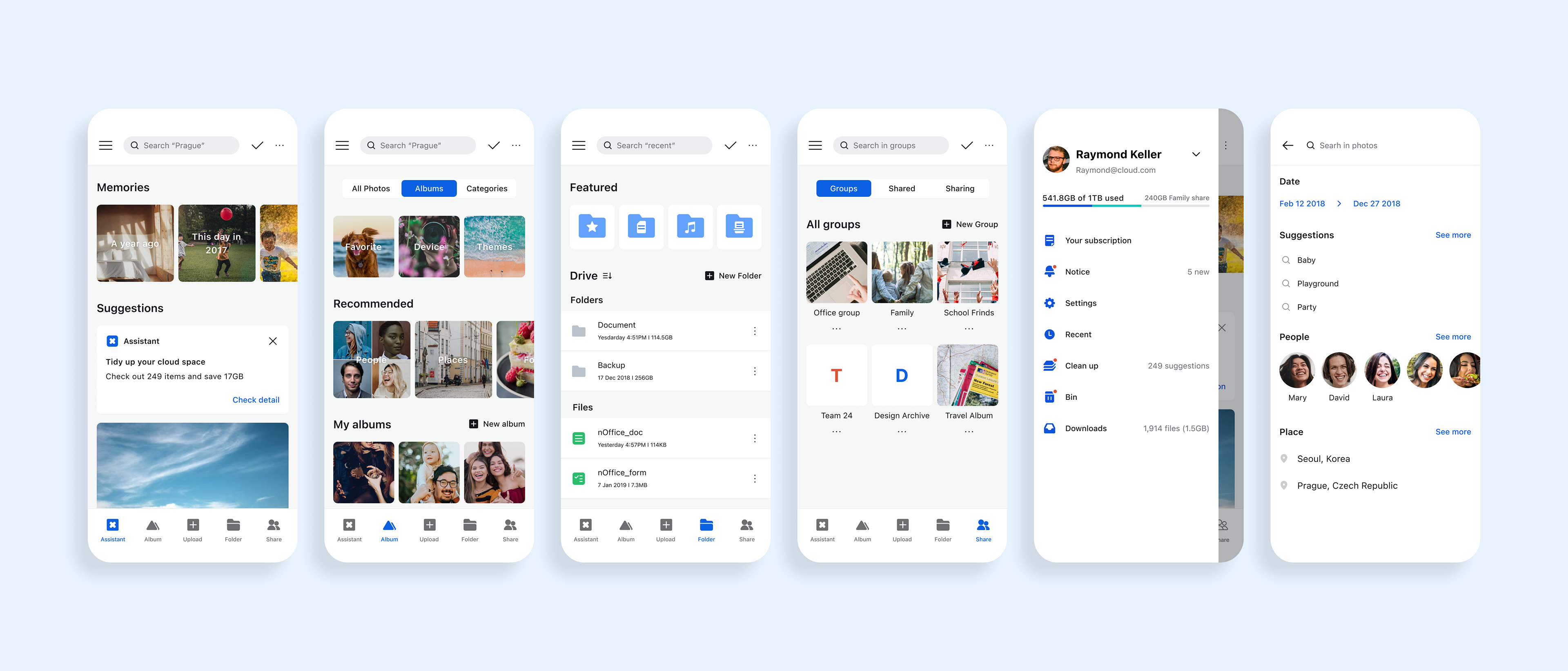
Wireframe & Use flow